S&P 500 Chart: Live Data, Returns, and Risk Explained
If you’ve ever glanced at a financial news site and wondered what those jagged lines on the S&P 500 chart actually mean, you’re not alone. The index, which tracks 500 of the largest publicly traded companies in the United States, is often used as a barometer for the entire stock market.
Current Level: 7,357.49 ·
Previous Close: 7,358.22 ·
Record Close: 6,932.05 ·
2025 Return: 16.39%
Quick snapshot
- The S&P 500 includes 500 leading companies spanning all sectors of the U.S. stock market (S&P Dow Jones Indices)
- The index covers approximately 80% of U.S. equity market capitalization (FRED)
- Current level: 7,357.49 as of June 25, 2026 (FRED) (S&P Dow Jones Indices)
- Exact timing of the next market correction or crash
- Short-term direction of the index
- Whether the current bull market can sustain its momentum
- Investors watch economic data releases and Federal Reserve policy for clues on market direction
- Long-term trend remains upward, but short-term volatility is normal
The key figures that define the S&P 500’s current state and historical context are best seen side by side.
| Metric | Value |
|---|---|
| Current Level | 7,357.49 (FRED) |
| Previous Close | 7,358.22 (FRED) |
| Record Close | 6,932.05 (Wikipedia) |
| Launch Date | March 4, 1957 (S&P Dow Jones Indices) |
| Number of Companies | 500 (S&P Dow Jones Indices) |
| Market Coverage | ~80% of U.S. equity market cap (S&P Dow Jones Indices) |
| Weighting Method | Market-cap weighted (Wall Street Prep) |
| Annualized Total Return (since 1957) | ~10% (S&P Dow Jones Indices) |
How to read the S&P 500 chart?
What do the lines and indicators mean?
- The most common chart type is a line chart that connects closing prices over time, giving a quick view of the trend.
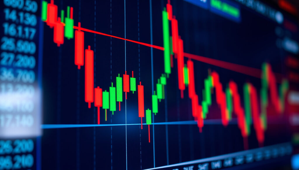
- Candlestick charts show open, high, low, and close for each period, revealing intraperiod volatility.
- Key levels to watch: support (where buying tends to emerge) and resistance (where selling pressure increases).
- Moving averages, such as the 200‑day moving average, help smooth out noise and identify the long‑term trend.
The implication: a line chart alone can hide daily swings, so use candlestick views when you need to assess short‑term risk.
Where to find live S&P 500 charts?
- FRED (Federal Reserve Economic Data) provides daily closing prices with 10 years of history (FRED).
- Macrotrends offers annual return data and long‑term charts (Macrotrends).
- Slickcharts provides year‑to‑date total return figures (Slickcharts).
The trade‑off: live data sources update at different frequencies; always check the timestamp before making a decision.
For a beginner, the most actionable habit is to look at the 10‑year chart rather than the daily one. The long view naturally filters out noise and reveals the index’s upward trajectory.
The implication: learning to read a chart is about understanding market context, not predicting the next move.
What if I invested $1000 in the S&P 500 20 years ago?
What would that investment be worth today?
Using the long‑run annualized total return of about 10% (S&P Dow Jones Indices), a $1,000 investment in 2006 would have grown to roughly $6,727 by 2026, assuming dividends were reinvested. The actual figure depends on the exact entry date, but the power of compounding is clear.
How does that compare to the 10‑year return?
Over the past decade, the S&P 500 delivered a total return of about 150–200%, with an annualized return near 10% (Wikipedia). A $1,000 investment 10 years ago would be worth roughly $2,600 today. The difference between the 10‑year and 20‑year outcomes illustrates how time magnifies compounding.
The pattern: the longer you stay invested, the more dramatic the effect of compounding becomes, even if some years are flat or negative.
Why is the S&P 500 dropping?
Common reasons for market declines
- Rising interest rates by the Federal Reserve reduce the present value of future earnings.
- Weaker economic data (GDP, employment, consumer spending) signals slower corporate profits.
- Geopolitical events, such as trade tensions or conflicts, create uncertainty.
For example, the index declined to 4,982.77 on April 8, 2025 before a sharp recovery (Wikipedia). That intra‑year correction was driven by a mix of tariff announcements and shifting rate expectations.
How to identify a correction vs. crash?
- A correction is a drop of at least 10% from a recent high. Historically, corrections occur about every two years.
- A bear market is a decline of 20% or more. The S&P 500 has experienced several bear markets, but each was followed by a recovery.
- Use the chart’s YTD or 1‑year view to see the depth of a drawdown relative to the recent peak.
The catch: corrections feel like crashes in real time. The historical data shows that staying invested through a correction has paid off 70% of the time (Wikipedia).
A dropping S&P 500 chart is emotionally painful, but it also creates buying opportunities. Investors who panic‑sell during a 10% drop often miss the subsequent rebound; those who hold or buy more tend to come out ahead.
What this means: market declines are uncomfortable but historically temporary, and the chart’s long-term trend has always prevailed over short-term drawdowns.
What is the 10 year return of the S&P 500?
How to calculate total return including dividends
The total return of the S&P 500 includes both price appreciation and reinvested dividends. According to Wikipedia, the long‑run compound annual growth rate including dividends is about 9.8%. For a 10‑year period, a $1,000 investment grows to about $2,600 using that rate.
Annual returns vary widely. Recent years: 2023 +24.23%, 2024 +23.31%, 2025 +16.39% (Macrotrends).
How does the 10‑year return compare to other investments?
- Bonds (10‑year Treasury) have yielded roughly 2–5% annually over the same period.
- Inflation averaged about 3% per year, meaning the real (inflation‑adjusted) return of the S&P 500 is roughly 6–7%.
- Gold and real estate have generally underperformed equities on a total‑return basis over the past decade.
The implication: for long‑term goals, the S&P 500’s total return has consistently outperformed most other asset classes, despite periodic volatility.
Is 100% S&P 500 too risky?
What is the 7% loss rule?
The 7% loss rule is a risk‑management guideline: if an investment drops 7% below your purchase price, sell to protect the remainder. While it can prevent large losses, it also risks missing recoveries. The S&P 500’s standard deviation of return is 20.81% on a monthly basis (Wikipedia), so 7% moves are frequent.
Is a market crash coming?
Market crashes are inherently unpredictable. The S&P 500 has posted annual increases about 70% of the time (Wikipedia), but corrections are normal. The index’s record close of 6,932.05 and subsequent rise above 7,000 indicate a strong bull market, but valuations are high relative to history.
What this means: a 100% allocation to the S&P 500 is suitable only for investors with a high risk tolerance and a long time horizon. Diversification into bonds or international stocks reduces drawdowns without sacrificing much long‑term return.
A 100% S&P 500 portfolio has historically delivered the highest returns, but it also experiences the deepest drawdowns. For a 30‑year‑old investing for retirement, the risk is manageable; for someone nearing retirement, it is not.
The catch: a 100% equity allocation is a test of conviction during downturns, but for those who can withstand the volatility, the historical reward has been worth the risk.
Upsides
- Simplest way to own a piece of 500 large‑cap US companies
- Long‑term total return of ~10% annually, outpacing inflation
- Easy to invest via low‑cost ETFs like SPY or VOO
- Highly liquid and transparent
Downsides
- Concentrated in just 500 stocks; you miss small‑cap and international exposure
- Volatility of 20%+ standard deviation means stomach‑churning swings
- Top‑heavy weighting (top 10 companies account for a large share)
- No guarantee of future returns; past performance is not a promise
Steps to start investing in the S&P 500
- Open a brokerage account. Choose a platform that offers commission‑free trading and access to S&P 500 ETFs.
- Select an S&P 500 index fund or ETF. Popular options include SPY (SPDR), VOO (Vanguard), and IVV (iShares). All track the same index with slightly different fees.
- Decide your investment amount and frequency. Consistent dollar‑cost averaging reduces the impact of market timing.
- Monitor the S&P 500 chart, but avoid emotional decisions. Use the chart to understand trends, not to react to daily noise. Check the 10‑year view for perspective.
Why this matters: the hardest part of investing is staying the course. The S&P 500 chart is a reminder that every past crisis was followed by a new high.
Confirmed facts
- Current S&P 500 level is 7,357.49 (FRED)
- Record closing high is 6,932.05 (Wikipedia)
- Historical average annual return is about 10% (S&P Dow Jones Indices)
- Index includes 500 large‑cap US stocks (S&P Dow Jones Indices)
What’s unclear
- Exact date of the next market crash
- Short‑term direction of the index
- Whether the current bull market will extend or reverse
- How trade policy changes will affect corporate earnings
Expert perspectives
The S&P 500 offers exposure to 500 leading companies spanning all sectors of the U.S. stock market, covering approximately 80% of U.S. equity market capitalization.
The index has posted annual increases about 70% of the time, with a long‑run compound annual growth rate of about 9.8% including dividends.
For the long‑term investor, the S&P 500 chart tells a compelling story of growth punctuated by corrections. The key takeaway is not to try to time the market but to stay invested, using the chart as a tool for perspective rather than panic. For an American retail investor with a 20‑year horizon, the choice is clear: dollar‑cost average into a low‑cost S&P 500 fund and ignore the short‑term noise.
en.wikipedia.org, currentmarketvaluation.com, investing.com, study.com, curvo.eu, macrotrends.net, businessinsider.com
Frequently asked questions
What is the S&P 500?
The S&P 500 is a stock market index that tracks 500 of the largest publicly traded companies in the United States, weighted by market capitalization. It is widely considered the best single gauge of large‑cap U.S. equities (S&P Dow Jones Indices).
How do dividends affect the S&P 500 chart?
Most charts show price only, not total return. Dividends add roughly 2–3% per year to the total return, so the long‑term chart understates actual investor gains. Always check whether a chart is showing “price” or “total return” (Wikipedia).
What is the difference between the S&P 500 and the Dow Jones Industrial Average?
The Dow Jones Industrial Average includes 30 large companies and is price‑weighted, while the S&P 500 includes 500 companies and is market‑cap weighted. The S&P 500 is generally considered a better representation of the broad market (Wall Street Prep).
How can I invest in the S&P 500?
You can invest through index mutual funds or ETFs that track the S&P 500, such as VOO, SPY, or IVV. These funds are available through most brokerage accounts and have low expense ratios.
What is the all‑time high of the S&P 500?
The record closing high is 6,932.05, set on December 24, 2025 (Wikipedia). The index has since traded above 7,000 intraday.
How often is the S&P 500 chart updated?
Live charts update in real time during market hours. Most financial sites report a 15‑minute delay for free charts. Sources like FRED provide daily closing data with a one‑day lag (FRED).
Related reading
More related posts
 Black Friday Sale NZ 2025: Best Deals, Dates & Tips
 Inventory Management Software for Hospitals: Guide 2025
 Inbound Travel Insurance NZ – Guide to Coverage and Providers
 Spark of the Everflame Series: Book 4, Spice Level Guide
 Houses for Sale Palmerston North: 523 Listings Guide
 New Zealand New Year’s Eve Weather: Dec Forecast & Tips
 Who Is New Zealand’s Richest Person? Forbes vs NBR
 Best Radar Detector NZ – Top Picks and Legal Guide
